ON THE FUTURE OF SOFTWARE
OCTOBER 2026
Last month, I upgraded all my daily-driver Apple devices to the latest versions of their respective operating systems: iOS, watchOS, and macOS 27. After all the complaints I saw online regarding the previous year's versions, I had decided to skip all that, keep my stuff on older (but still supported) releases, and wait to see what would happen. What a relief it was to hear "platform improvements and stability" be some of the first words uttered in the keynote this time around.
Online chatter was near-unanimous that this summer's run from beta through public release was one of the smoothest in recent memory, with most major issues from iOS 26 and macOS Tahoe resolved. Because of that, I thought it was safe to ignore the conventional wisdom of waiting for the first few patches before upgrading. While the software has indeed been fairly smooth from a technical standpoint, the qualitative day-to-day experience is noticeably poorer, and I'm not happy about it.
Apple pitched its new "Liquid Glass" design as the foundation for a future generation of software, one that would eventually be unbounded from today's finite, rectangular screens. We were told that a key priority of the new look was to allow your content to shine through while keeping the interface legible. But after experiencing it for myself, I think it fails spectacularly in both goals. The flashy refractive effects and blobby animations cause the UI to draw attention to itself far too often, and simultaneously it's far too easily overwhelmed by what's behind it. This is especially problematic with text, where contrast between foreground and background is critically important for readability.
It was so bad that Apple was forced to repeatedly adjust its appearance during and after the beta period, and now, with iOS and macOS 27, the user has simply been given direct control over the glass's clarity. This motif was supposed to be foundational. The near-continuous adjustments and reworks stand as an indictment of its designers, who clearly gave very little diligence in crafting the actual user experience of the Liquid Glass concept.
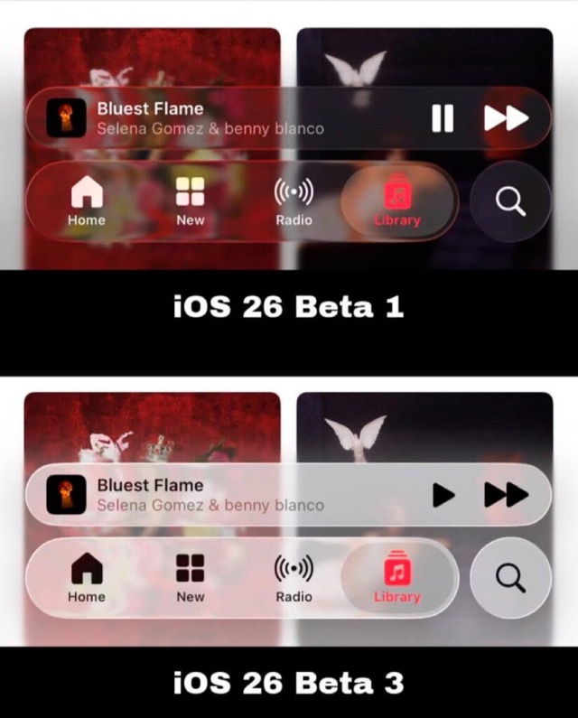
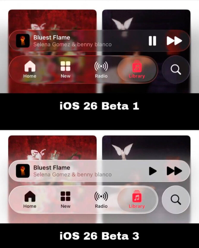
 Repeated attempts to resolve complaints about the readability of the Liquid Glass UI.


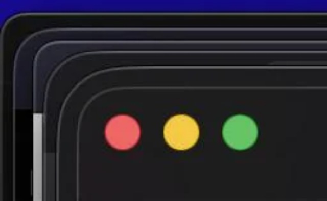
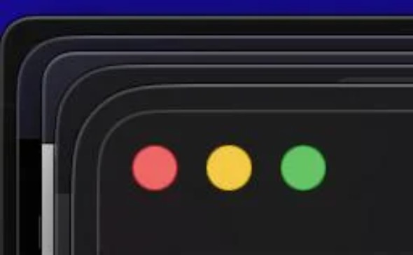
Lots of inconsistency in the corner radius of macOS Tahoe's windows and sidebars.
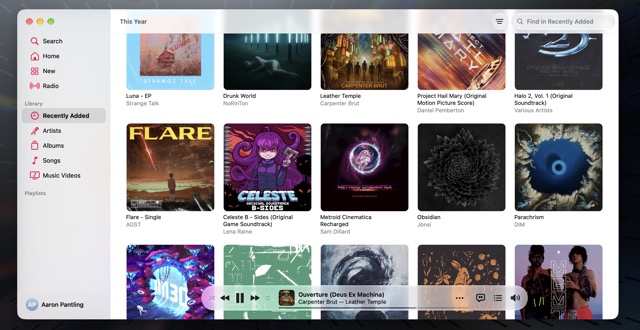
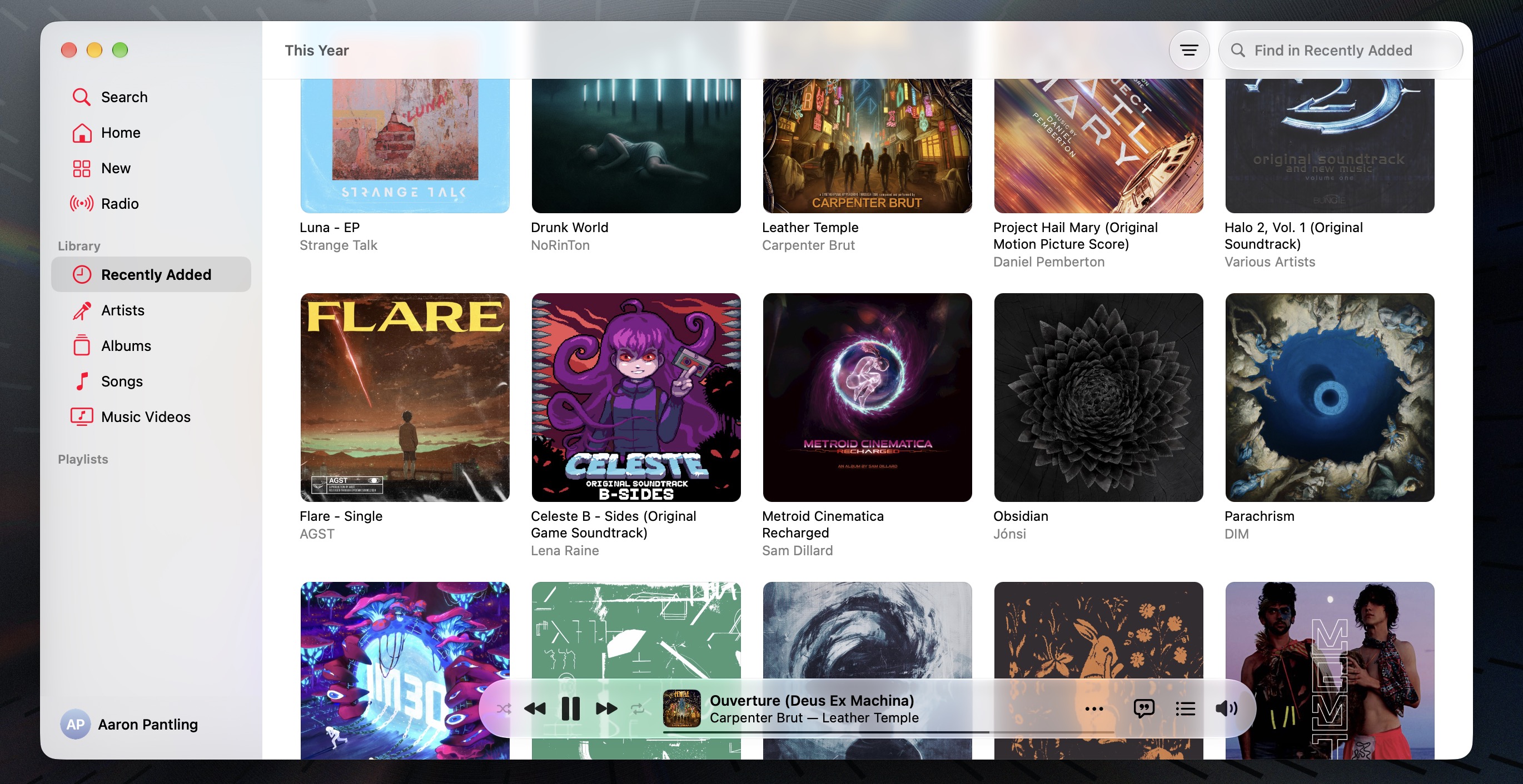
The Music app didn't need to be redesigned like this.
Out of all my devices, macOS got the worst of it by far, in ways I hadn't even thought to anticipate. Launchpad was removed, replaced by a more elaborate Spotlight interface that requires more interaction to open an app (when it works, that is). The battery icon was unnecessarily redesigned into the same difficult-to-read compact form used on iOS. Indicators for screen brightness, volume, and Bluetooth devices have been moved from the center of the screen to the corner and put on top of particularly-hard-to-read glass. The player controls in the Music app were moved from the toolbar to a floating view on the bottom of the window, and the hover controls that let me quickly select and play an album are gone. And that's just the intentional changes. Many small behaviors of Mission Control have gotten clunkier, UI animations in some apps are laggy and do weird things with the layout, the display flickers when waking from sleep, and for some confounding reason I can't reliably double-click files in Finder anymore. How the #!&?$ do you break an action as fundamental as double-clicking? Every so often, I have to deliberately double-click slightly faster or slower to get it to register.
Having skipped macOS Tahoe, I'll give them the benefit of the doubt and assume all those things were actually broken a year ago and simply not fixed here, rather than being brand-new regressions. But however it happened, I "upgraded" and the software is now worse to use. Not cool.
How designs mature
All technologies evolve along an asymptotic path, with rapid development followed by long, slow refinement. For example, the Ford Model T, the first affordable mass-produced car, had driver controls that are quite alien to our present-day experience. Competing manufacturers went with different schemes, de facto standards quickly emerged, and just one generation later, in the 1928 Model A, the controls are already mostly recognizable to the modern driver. Development continued past that, obviously, and it would be a few more decades before cars began outwardly resembling the vehicles of today, but the basic architecture has persisted for nearly a century now.
Software went through a similar revolution in the 1990s, taking us from command-line DOS to early graphical versions of Windows to the NT kernel, culminating in the release of Windows XP in 2001. Macs had graphical user interfaces since their inception, but Mac OS X was the major architectural change that would successfully catapult the platform toward the present day. This era was also marked by the development of the Linux kernel, the standardization of the HTTP protocol on which most of the internet runs, and much more.
When a breakthrough of some kind happens, the cycle begins anew. Smartphones already existed in 2007, but in a rudimentary form descended from basic cellular phones and PDAs. The pinnacle of this ecosystem was the BlackBerry, but even that instantly looked clunky and old when the iPhone was unveiled. Android was already in development at the time, but its course was swiftly altered to compete with iOS and together the two new platforms swept the market, displacing all others within just a few years. And this brings us to the first controversial Apple design change: 2013 and the release of iOS 7.
When Jony Ive was given control of software design in addition to hardware, he immediately discarded the "skeuomorphic" visual foundation of iOS up to that point and replaced it with a wholly abstract look. Was that necessary? Of course not; software can look like anything, as Ive himself said at the time. But packaged with the aesthetic realignment also came a whole host of meaningful improvements to the way we used our devices. Common system settings were brought together to form Control Center, the app switcher took a major leap forward to almost its present-day form, now-mainstay features like AirDrop and CarPlay were introduced, and so on. There was a clear distinction between "before" and "after" in every way, validated by the genuine improvement in usability.
Some small aspects of the design did turn out to be a bit too minimalist and had to be adjusted based on user feedback. But overall, once people got used to the new look, the complaints went away. iOS 7 was a competent design and a strong foundation for the iOS experience of today. At least...until last year.
What major new usability breakthroughs came with Liquid Glass to accompany its visual overhaul? It was built for a hypothetical future, not the needs of the present. What new essential features did it bring? There's a whole bunch of Apple Intelligence stuff, but most of those features were first promised years ago, and they can't even run on all hardware supported by the OS itself!


The mostly-recognizable dashboard of a 1931 Ford Model A. (Photo by Kenn Peters)


A Compaq Presario 700 laptop, circa 2001.
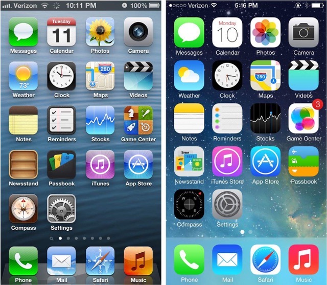
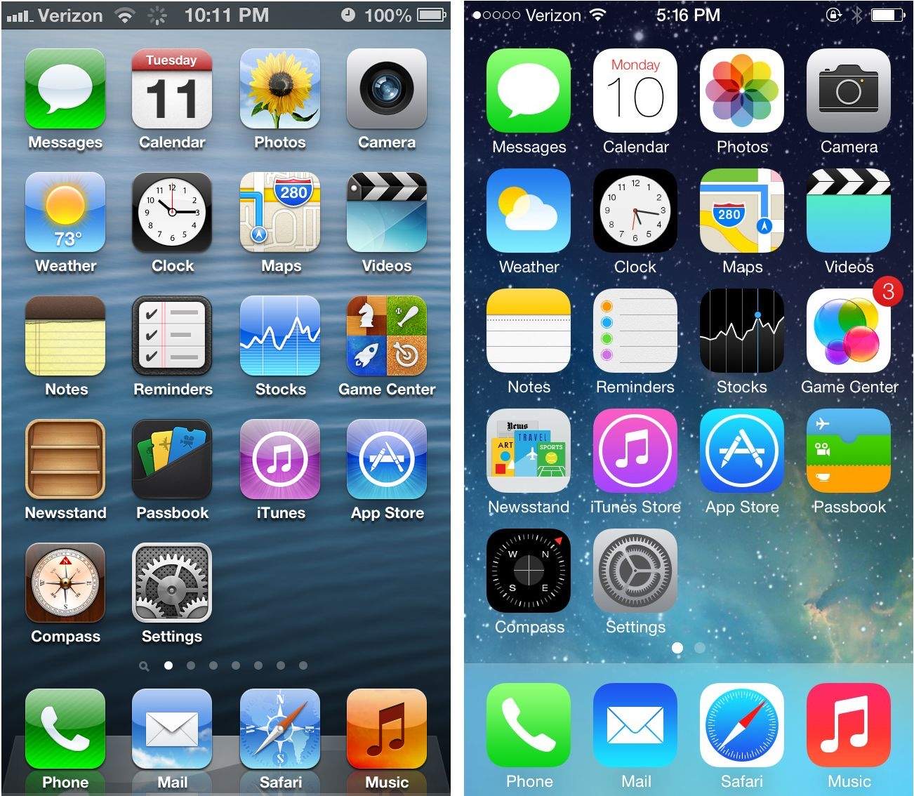
The last major UI design change: going from iOS 6 to iOS 7.
Shiny new things on eroding foundations
I've spent this entire essay so far excoriating Apple, but that's just because their products are the closest to my daily life. By trade, I'm a Windows sysadmin, and from that vantage point, I can tell you pretty much this entire industry is slowly running out of steam. In many ways, what Microsoft has been doing for years now is far more egregious than Apple's recent missteps.
Here's the fundamental problem: pretty much all the low-hanging fruit is gone, and institutionally, we've grown tired of maintaining what already exists. Sometimes it is truly beneficial to throw something out and start over, like a focused effort to consolidate or refactor accumulated technical debt, but that's not what's happening in most cases. No, instead we're just reinventing the wheel and building new stuff on top of old, crumbling foundations. Many companies have become infected by a mandate to cut costs and increase revenue above all else, and many open-source projects have been taken over by activist contributors who are remaking fundamental things based on their own motives.
Ironically, at one point Microsoft actually seemed like they understood how to handle this state of maturity. Windows 10 was said to be the final major release of the OS, pivoting to a service model that would evolve and maintain the software as needed in the future. That lasted for about six years, until Microsoft suddenly announced that there would indeed be a Windows 11. That's fine, nothing lasts forever and frankly I was surprised that they had even made such a promise to begin with. I wasn't even bothered by the fact that the major version bump was defined by little more than a reskin, responding to the declining popularity of flat design. They didn't even charge existing users for the upgrade.
No, the problem was that the cosmetic redesign was a shoddily constructed layer on top of Windows 10. The new taskbar and Start menu were created using the web framework React Native instead of ACTUAL native code, and classic behaviors (like pinning an item by dragging it into either the Start menu or taskbar) were missing. The new right-click menu in File Explorer only had half the items it used to, with a "More" link that just...showed the old menu. A couple of times, the entire File Explorer window malfunctioned on me and somehow straight-up reverted to the Windows 10 version.
That fragmentation between old and new is a plague in modern software design. The low point was the infamous original release of Windows 8 in 2012, with its new Metro UI existing as an entirely separate environment from the traditional desktop with very limited ways to switch between the two. There wasn't even a traditional Start button until severe public outcry forced them to backpedal. Windows 10/11 is a lot more reasonable, but if you need to dig deep enough into the settings, you will eventually be forced to use a dialog that's a relic from an ancient era. It would be better to redesign things into a consistent form, but if you're not going the distance, keeping the fallback around unchanged is a lot more honest than just getting rid of it with no replacement.
Most of this stuff isn't worth getting mad about. I built my Windows PC as a tool for digital art and rendering, and the OS mostly stays out of my way for that focused work. But during the day, I have to get significantly deeper under the hood, where I see firsthand just how deep the rot extends.
Legacy Windows administration, with domain controllers, Group Policy, and so on, can be quite arcane and unintuitive. But it's been consistent for 25 years, with well-understood tools and troubleshooting strategies. The "modern" cloud-native successor product, Microsoft Intune, features an entirely different architecture. Now, that's not inherently a fault; after all, the cloud is a very different beast than on-premises networks, and many an organization has been burned because they disregarded that. But I don't know, perhaps they shouldn't have just THROWN OUT everything they didn't know how to optimize for the cloud.
I'll spare you the itemized technical rant on every single way Intune is deficient, but allow me to explain the omission that I find perhaps the most insulting. If you pull up a group of users or devices, you might expect to be able to see what applications or policies are assigned to them, right? This was trivially simple in the old Group Policy Management tool, yet Intune gives you nothing of the sort. You can only look at it from the other way, and unless you remember what apps and policies you need to go check, good freaking luck figuring it out. I've heard in person from the horse's mouth—one of Microsoft's principal software architects—that the feature is missing because it's "too slow" for the web console. Apparently, processing group membership and assignments is the heaviest part of the device sync process by a good bit. In the ten-plus years that Intune has been available, how come it's never been an engineering priority to make such a fundamental thing any more efficient?
Trying to get support for all this has been infuriating. Either our Microsoft rep is terrible at finding people who can actually help us, or there's simply nobody left who understands how all these systems really work. Instead, the overwhelming impression is that their prime engineering resources are completely focused on...AI!
The promise and reality of an agentic future
It's inescapable. Every product, every service, every marketing pitch is saturated with hype and promises. This entire new world is still deep in its own rapid-development phase. Behind the scenes, there has been a mad dash to allocate resources as quickly as possible no matter the cost, upending markets for everything from GPUs to structural steel. Customer demand, token use, and every other metric continue to rise with seemingly no end in sight. At the start of this year, I would have sworn it was a bubble that would pop any day. But now I have no idea.
Focusing on AI's role in the creation and maintenance of software, much has been written about "vibe coding," where you act as project manager and let the model do all the work. This puts serious development work within reach of those who lack the time, knowledge, or technical aptitude to write all the code themselves. There's no doubt that it produces real and usable results. But I've seen enough reports online of agents going haywire to give me serious pause. At best, the model might make a stupid mistake and offer an insipid apology when challenged. At worst, it might do something catastrophic like delete your entire repository. Anyone who blindly trusts these systems is a fool.
I'm well aware that the world is already full of poor-quality production code written by developers who barely understand their technology. That's been the case long before these large-language models (LLMs) existed, when the deep magic was to simply to copy stuff verbatim from sites like StackOverflow. Famed computer scientist Brian Kernighan wrote that "debugging is twice as hard as writing a program in the first place." Even the nominal copy-and-paste coders of yore at least had their hand on the creation of their work, yet today people are shipping code they might have never even read. If anything goes wrong, their only hope is to type another prompt and pray that the agent doesn't simultaneously break something else while trying to fix the problem.
The lifecycle of knowledge has also been interrupted. The number of new questions being asked on Stack Overflow has plunged to historic lows. (I'm sure some of that also has to do with the site's increasingly toxic and beginner-unfriendly culture, but that's a separate issue.) Every small forum and website has long since been scraped for training data, and now Google just answers your question itself instead of directing you to a resource that would benefit from your visit. And if you do venture into the search results and click on something, there's a very good chance it'll be some kind of blog site that just posts pasted LLM outputs anyway. There's less motivation than ever to contribute new information to the ecosystem.
All of these issues are setting up a crisis of maintainability. Even if most large companies weren't aggressively laying people off and transferring responsibility to subpar overseas teams, those long-tenured engineers would be retiring anyway. With no one to carry their torch forward, their work is falling into disrepair at an accelerating rate. The chance of a total collapse is probably small, but there are enough single points of failure that one of them is bound to break eventually.
Some might consider it utopian to simply abandon these old foundations and move to an all-new future. Assuming such a thing can even be done (without still relying on the same heritage dependencies as everything else), in my opinion this would be disastrous. I don't want to work in a world where formal specifications are obsolete, where every piece of code is disposable, and at worst, where interaction devolves to the form of you talking to your agents, talking to my agents, talking to me. Civilization runs on established standards. If it ain't broke, don't fix it.
What should you do?
At this point, I'm not sure we can turn this around. Our entire culture has largely lost its interest in preserving the things of old. We prefer the convenience of streaming over the work of curating a personal library of media, we buy cheap clothing instead of forking over cash for stuff that will last, and in a lot of industries, they simply don't make things like they used to at any price. I feel like I'm part of a shrinking minority that prefers timeless things more than new things.
But it only takes one person to stand up and lead, and inevitably others will follow. Whatever your craft, be it technical or even something else, strive to be a master of it. I've outlined my concerns with the trustworthiness of AI tools, and beyond that, there are unsolved ethical and legal issues surrounding the provenance of training data. Even though I'm extremely hesitant to use it myself, I don't necessarily think down of others for doing so. But if you use it, you must use it as a force multiplier, never a crutch.
Isaac Newton said, "If I see farther than others, it is only because I stand on the shoulders of giants." We would do well to remember that.